This article’s intention is to share my experience using Apache Echarts https://echarts.apache.org/ for an Analytics product in an Angular App.
The Angular wrapper used is ngx-echarts
https://www.npmjs.com/package/ngx-echarts
Our team had to build an Analytics app to create the queries and the reports of the internal data of each client.
The documentation is excellent, you have a lot of examples and you can play with those.
You will need to create a component to deal with the library and be careful to set the options depending on the chart you are showing.
Every chart has its own “tweaks”so you can show it properly: labels, positions, colors.
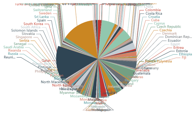
Our main problem was when the user built (or by data condition) a chart that had a lot of values. That can cause some visualization issues because the labels are shown one on top of the other or you see an ugly chart.
Considerations:
- If your chart has a lot of different values you might show the labels only “on trigger” (when the mouse is on top of the element)
- If the label might be large (long names) you have to add a formatter function
formatter: function (value,) {
            if(value&&value.length>60){
                return value.substr(0,59)+'..'
            }else{
                return value;
            }
        }
-
You need to be careful about the charts and labels, for example in the bar charts. You might end with the labels of each data that overflow and are hidden out of the container.
The library doesn’t auto adjust the padding to show the labels
so you need to explicitly add a gap and use the property containLabel which tries to auto adjust the padding
grid:{
    containLabel:true,
    top:50
    ,bottom:150
    ,left:130
}